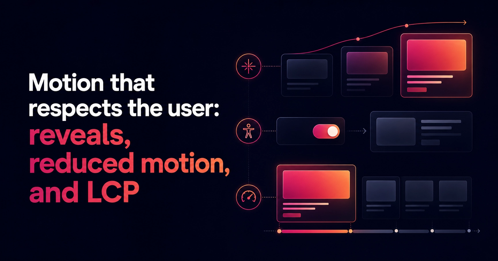
Scroll reveals are the seasoning of modern web design: a little lifts the whole dish, too much ruins it. The difference between the two isn't taste — it's whether each animation has a job.
Every animation needs a job
- Entrances confirm reading order — stagger siblings by index, around 80ms apart
- Hover states confirm interactivity — a lift, a glow, an arrow nudge
- Route transitions preserve context — one shared page-enter, nothing bespoke
Reduced motion is a requirement, not a nice-to-have
The classic failure: hide content with opacity zero, reveal it on scroll. If JavaScript fails — or the visitor prefers reduced motion — the content simply never appears. The fix is to do the hiding inside the media query, so the animated state is the exception, not the default.
/* hide for animation ONLY when motion is welcome */
@media (prefers-reduced-motion: no-preference) {
  [data-reveal] {
    opacity: 0;
    transform: translateY(22px);
  }
  [data-reveal].is-visible {
    opacity: 1;
    transform: none;
  }
}
Never gate the LCP on hydration
Hero entrances should be pure CSS animation, so the first paint never waits for a JavaScript bundle. Save observer-driven motion for below the fold, where a few dropped milliseconds cost nothing.
If the user notices your animation system, it's too loud. If they'd miss it when it's gone, it's right.
Motion done this way disappears into the experience: the page feels assembled rather than animated, and nobody can quite say why it feels good. That's the goal.