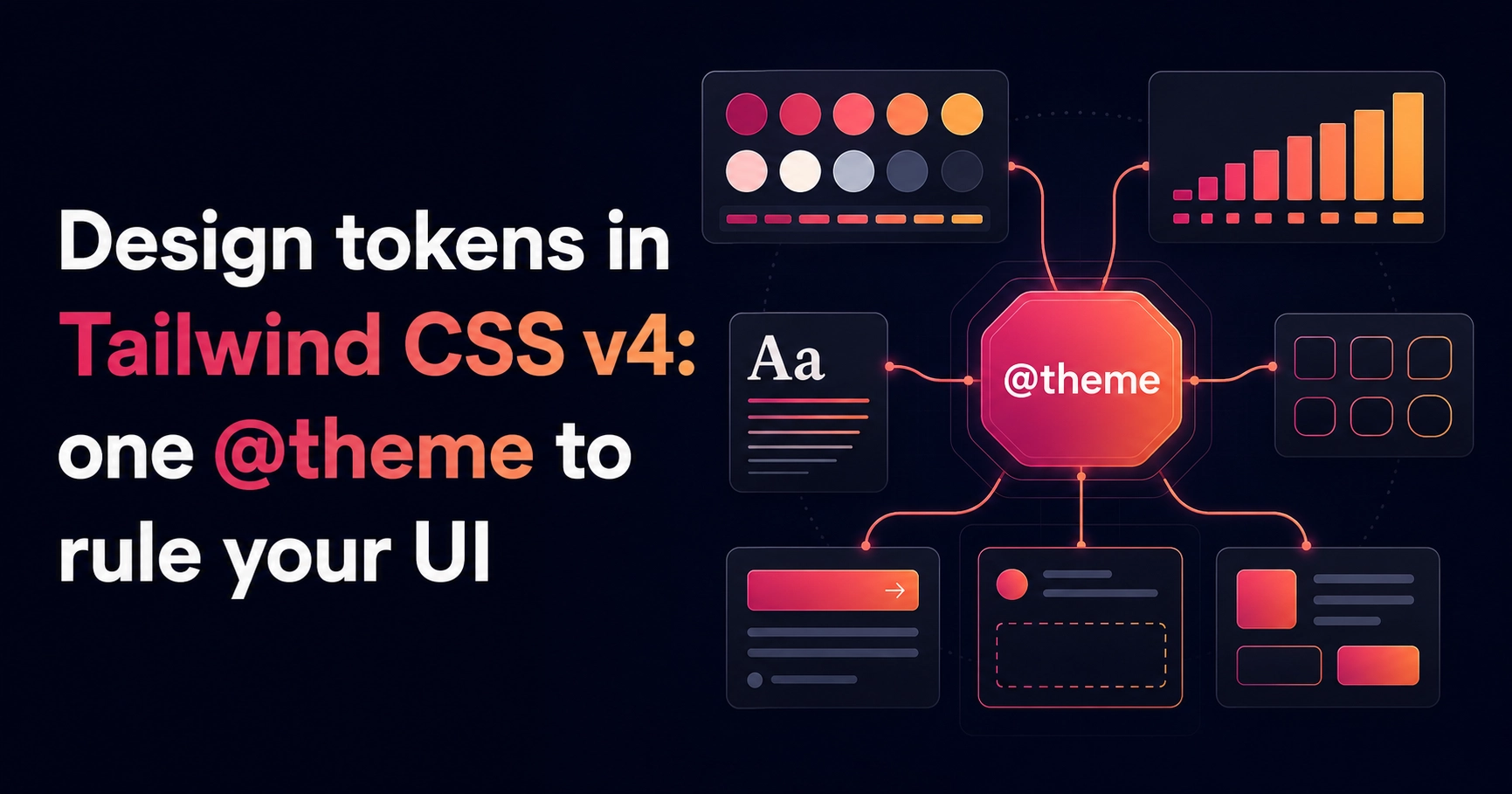
Tailwind v4 retires the JavaScript config file: your design system now lives in CSS, in a single @theme block that turns every token into both a CSS variable and a utility class. It sounds like a small change. It quietly fixes how teams name things.
Name the role, not the colour
Raw palette names (slate-800, violet-400) leak implementation into every component. Semantic tokens — bg, surface, ink, muted, line, accent — describe what a colour is for, so swapping the accent or retuning contrast is a one-line change instead of a codebase-wide find-and-replace.
@theme {
  --color-bg: #0a0a0c;
  --color-surface: #121216;
  --color-ink: #f4f4f5;   /* primary text */
  --color-muted: #a1a1aa; /* secondary text */
  --color-line: rgba(255, 255, 255, 0.07);
  --color-accent: #f43f5e;
}
Each token doubles as a class (bg-surface, text-muted, border-line) and a variable for the occasional handwritten rule. One source of truth, two ways to consume it.
A dark-first palette is a contrast budget
- One accent, used sparingly — everything else stays neutral
- Hairline borders at 7% white do the separating work shadows do in light UIs
- Elevation is a slightly lighter surface, not a bigger shadow
A design system isn't the components. It's the constraints that make the components look inevitable.
Keep the token count under twenty. If a value shows up twice without a name, name it; if a token hasn't been used in a month, delete it. The system stays legible exactly as long as it stays small.